Diestra Website Redesign — Clear Communication for a Modern Financial Brand
Overview
Diestra is an independent collection agency based in Mexico. The company approached me with the goal of redesigning their website to better reflect their updated service offerings and attract new clients, while also showcasing their previous projects and professional expertise.
Challenge
Diestra’s existing website no longer represented the company’s evolution or communicated its value proposition effectively. The client wanted a modern, clean, and straightforward design where clarity of information and ease of contact were the top priorities.
Process
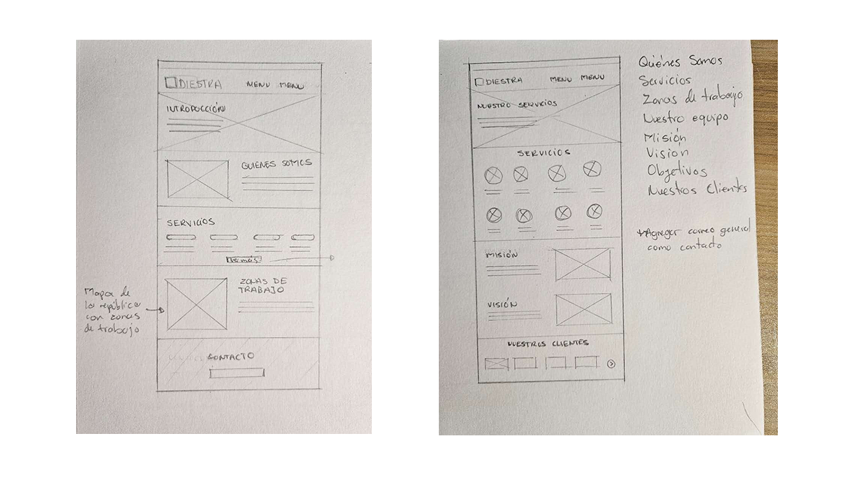
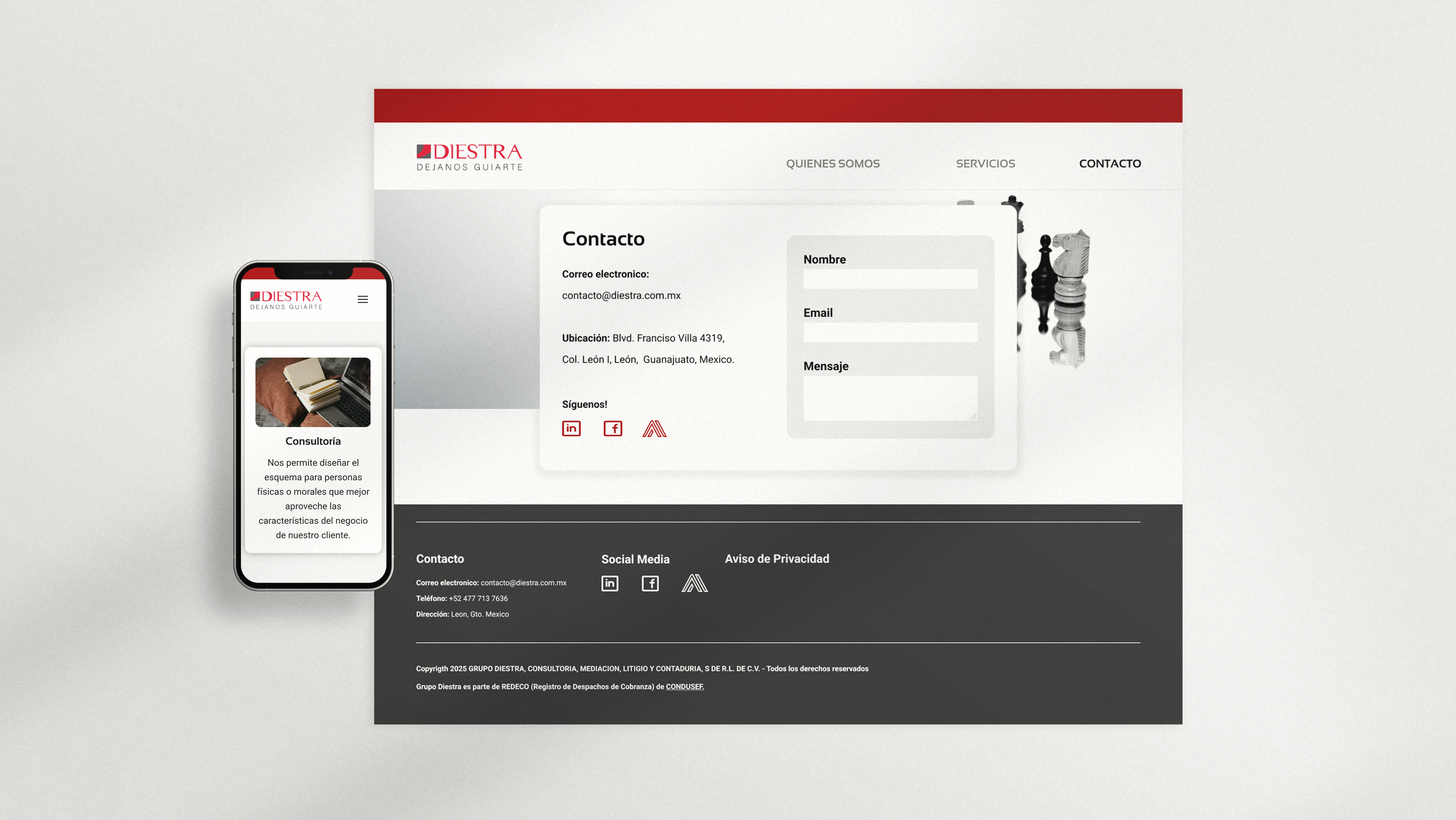
The project began with a series of meetings with Diestra’s management team to gather key information about their services, coverage areas, and overall mission and vision. From there, I developed a series of wireframes to define the site structure and user flow, presenting the logic behind the layout and navigation.
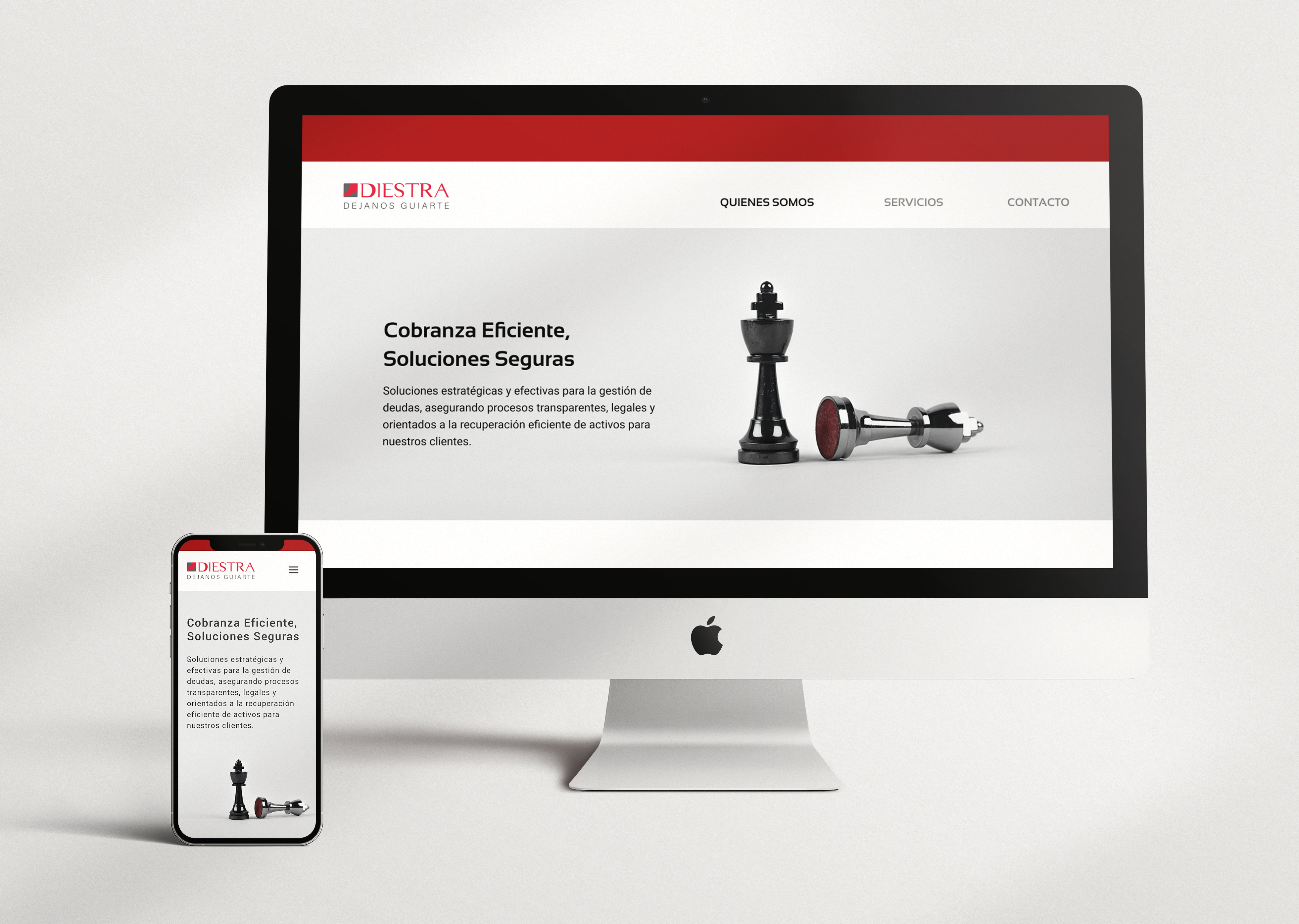
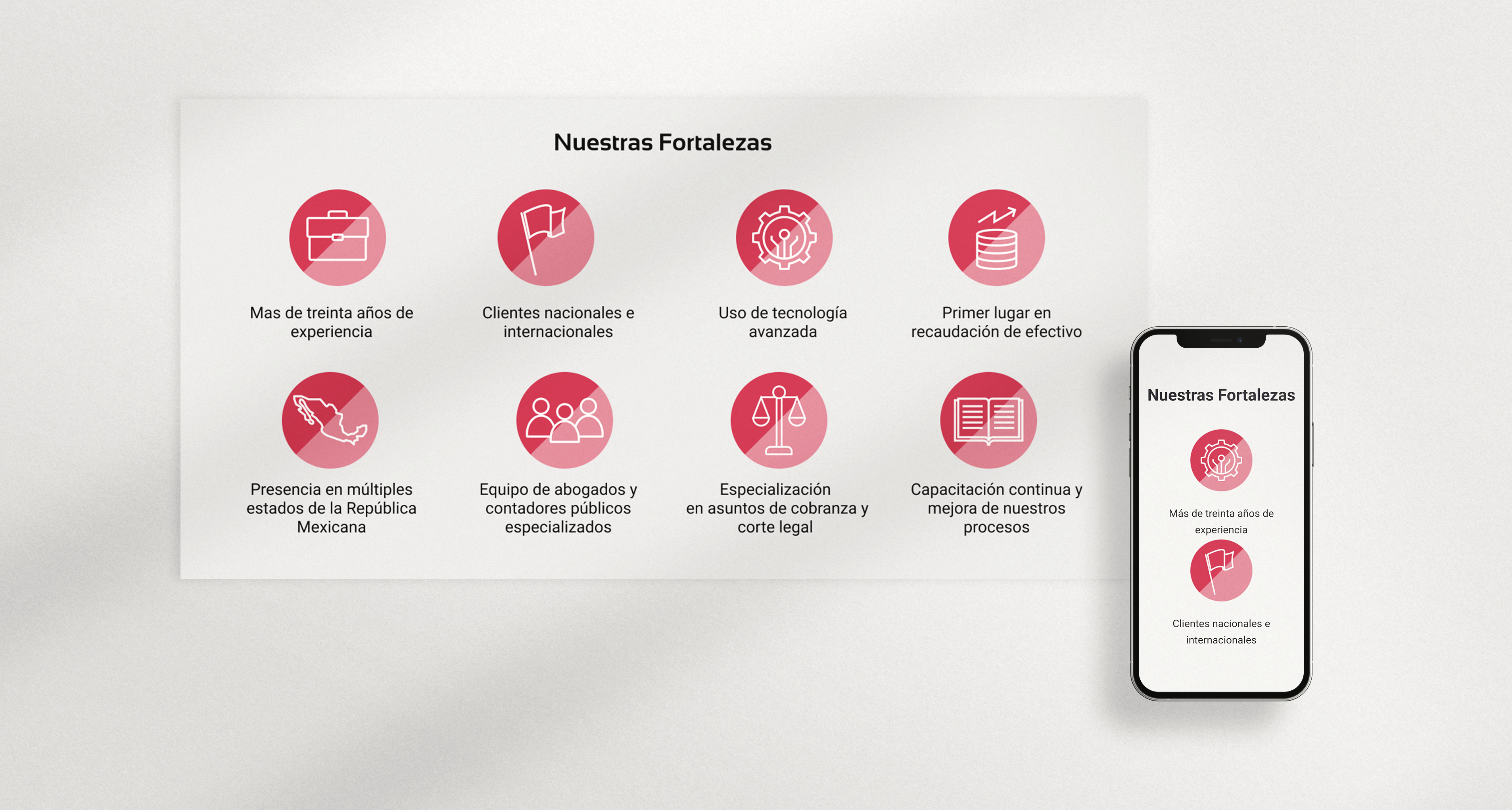
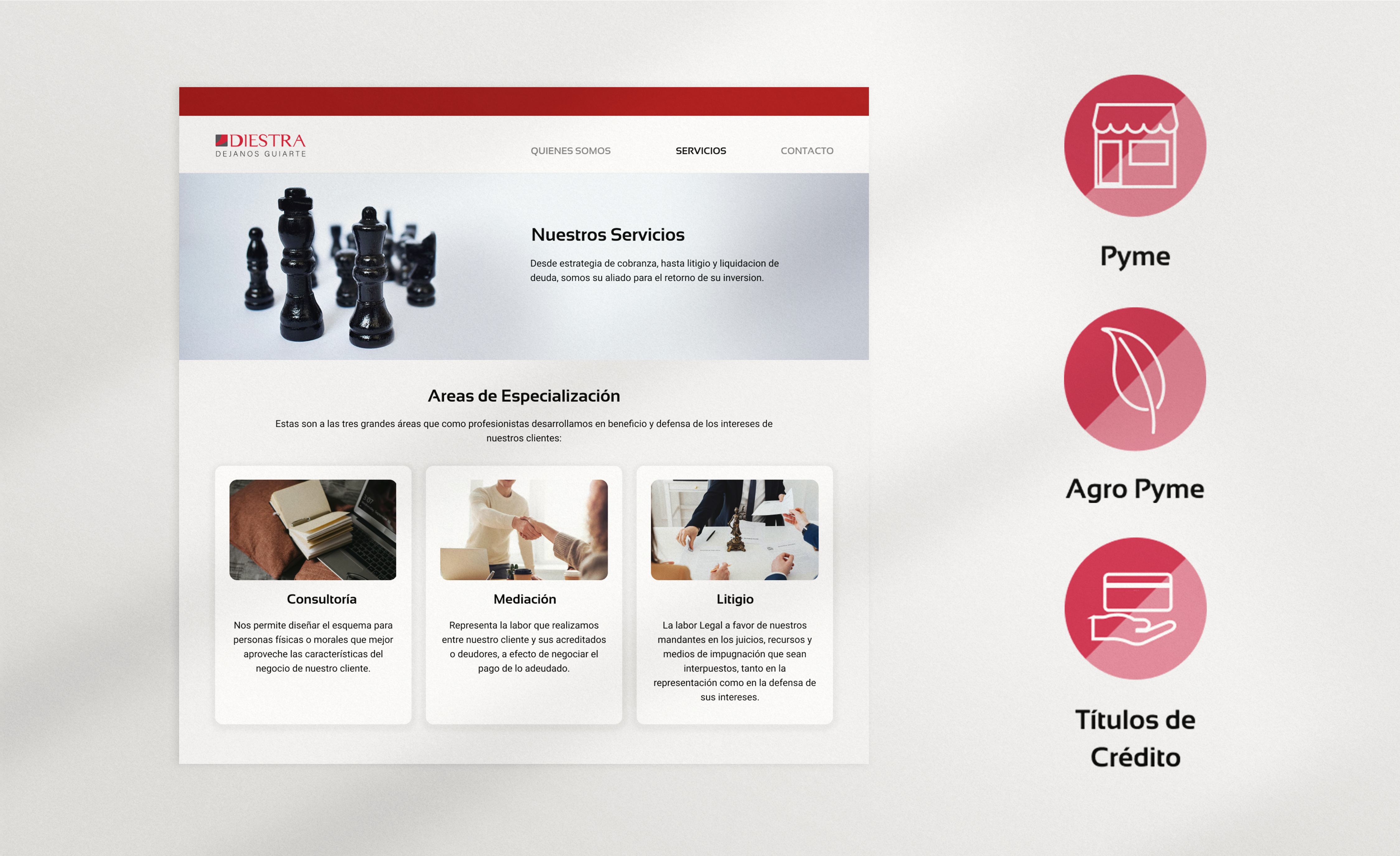
Once the structure was approved, I collaborated with the client’s business development team to refine and write the website copy, ensuring it aligned with their tone of voice and objectives. I then created high-fidelity prototypes that followed Diestra’s existing visual identity and branding, elevating their professional image through a clean and minimalist interface.
Outcome
The final website provided Diestra with a clear, concise, and visually coherent platform to communicate their services and expertise. The redesign not only modernized their digital presence but also helped strengthen credibility with potential clients and partners, aligning their brand image with their current positioning in the market.
You can check the live project here.